DriverInbound
Project Overview
DriverInbound is a mobile app that aggregates user-submitted guides on approach and parking for delivery truck drivers. The app hosts guides for thousands of locations, making it faster, safer, and easier to deliver in a world where time is money.
As with any profession, truckers have a language all their own, distinct from typical online lingo. Ensuring the app communicated with all truckers, no matter how tech-savvy, meant I had to immerse myself fully in trucker culture and learn their language for myself.
Click on an image to enlarge it.
What I Did
When I joined the team, the app’s core functionality and UX were already strong. The UI, on the other hand, wasn’t where it needed to be. It was nearly illegible, poorly laid out, and overall lacking in direction, which meant a fantastic app was rendered almost unusable. It called for a full rework, and I took to it eagerly.
The first few steps happened in Figma. To start, I created an entirely new layout that emphasized clean, transparent navigation, temporarily ignoring scale so I could iterate quickly. I worked in black and white and repurposed the original mockup's .PNG iconography to save time and reduce bias.

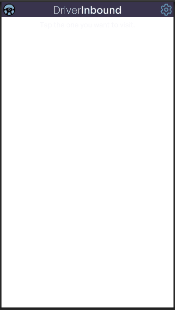
Once the initial mockup was approved, I created a logo to base the app’s new iconography and style on. Our primary stakeholder was enthusiastic about a steering wheel logo, so after some iteration, we settled on a smooth, rounded design based on the wheel of his own truck.
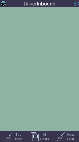
With that, the time was ripe for icon explorations. While some of these icons may be opaque to non-truckers, I did extensive user testing among our Founding Drivers to guarantee their legibility to our target audience.
New icons called for a revisit to their presentation. These icons convey vital information to drivers, so they had to be easy to see and easy to tap, in case the driver needed an explanation of the icon's meaning. To that end, I moved icons from the top bar to the main post body. This was also around when I settled on a color palette, after making a fair number of proposals to present to the stakeholders.
I also reworked the app’s scaling. Smaller text meant better padding, and the text had been so huge on my previous mockups that legibility improved. I took these lessons forward to develop the login and search screens for the app with comparative ease.


My favorite part about implementation was the opportunity to animate my work in Unity. I’ve included a selection of my animations below, so you can see the app in action. Naturally, every screen in the app is dynamic, and will work seamlessly on all common mobile and tablet aspect ratios.
Postmortem
To say I learned a lot while working on DriverInbound would be an incredible understatement. The project inspired me to test my limits and hone my skills in incredible new ways, from creating all-vector iconography to mastering the use of dynamic aspect ratios in Unity’s Canvas system.
You can download DriverInbound on the Android and iOS app stores.